
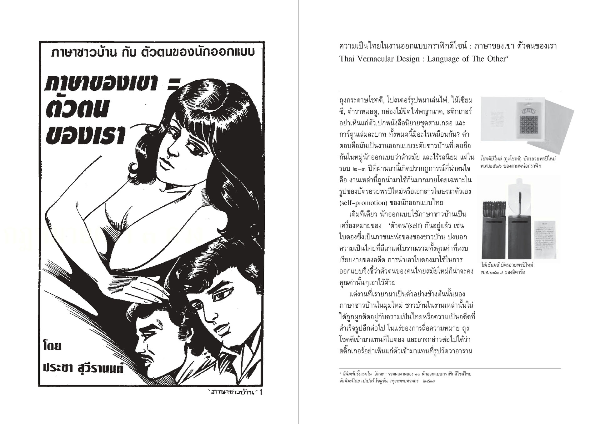
The »Chokdee« shopping bag, the »dogs playing cards« poster, the Seamsee fortune sticks, the fortune teller´s manual, the Naga matchbox, the »Don´t Be Selfish« sticker, the cover design of the »Samgler« series, and the one-baht comic books, what do these items have in common? The answer is that they all had once been vernacular Thai objects. Once branded as tasteless and outdated, now they have become fashionable. Over the past couple of years Thai designers have been turning them into New Year greeting cards, and incorporating them into their self – promotion publications.
Until recently, Thai designers have been basing their identity on folk Thai objects. Common items such as the banana leaf, used for food packaging since the ancient past, speaks of traditional Thainess and the peaceful simplicity of the past. To use the banana leaf in modern design should then signify the persistence of those values among modern Thais.
Yet our samples show a paradigm shift from design based on folk Thai to vernacular Thai objects. Folk Thai has become too ready-made and is no longer popular. Vernacular Thai designs are born of consumerism, aimed just for entertainment and rootless in their commercial nature. They are not associated with mainstream Thainess in the traditional sense. The vernacular Thai has replaced the folk Thai in terms of meaning and position: the »Chokdee« shopping bag has replaced the banana leaf, the »Don´t Be Selfish« sticker has replaced the pictures of temples, the dogs playing cards poster has replaced the local deity prints, and so on.
In 1994, the banana leaf became the logo of a business corporation (that wishes to sell Thainess as commodity), while the »Chokdee« shopping bag came to represent the identity of designers (who see these items and themselves as more authentic). The fact that it was the latter not the former that came to stand in for the designers’s identity is an indication of the greater value now endowed on vernacular Thainess, at least in the design world and among its competition circuit.
At first glance, both folk Thai and vernacular Thai objects seem to share a similar function in designers’ appropriation of the past to express present identities. (For instance, allusions to folk Thai things might speak of the need for present values to be anchored in the past, or a good designer is one whose starting point is the culture of ordinary people.) What makes the »Chokdee« shopping bag unique, if problematic, is its ability to recollect and make visible a particular historical period, and not a timeless past as does the banana leaf.
While the banana leaf is rooted in some unidentifiable past, the »Chokdee« shopping bag comes from a particular historical period. It is a product that has only been around for 40-50 years, which came into circulation at the beginning of Thailand’s modernization period. While the origins of folk Thai objects are nearly impossible to trace back to their anonymous creators, Vernacular Thai things have a more certain past. They tended to be created by commercial artists whose influences can still be felt today. In short, the »Chokdee« shopping bag can convey the ancestral origins of the Thai »designer« more convincingly and with greater directness.
While local deities have long been forgotten (though they are resurrected from time to time), the »dog playing cards« poster and the one- baht comic books are still alive and well in the daily lives of Thailand’s common people.
In this respect, the values of folk Thainess and their artists are more abstract when compared to vernacular Thainess. Objects that speak of the latter are made by sign makers, comic artists, book designers, and printers. Their works seem more down to earth, full of life and humanity.
We could even go so far as to say that the works of the latter are part of the cultural democratization process in Thailand. At first glance, this appears to be an opportunity for low-status, vernacular Thai icons to take the center stage and claim some cultural space.
However, we cannot forget that such space belongs to the designers. It is a stage for them to present their own identity. Their appropriation of vernacular Thai objects may not arise from the desire to pay respect or to give praise. It’s possible that their production of a new set of signs and meanings from such a source boils down to nothing more than creating for the sake of being different. The presence of vernacular Thainess in cultural space may seem to be an effort to re-define ‘common people’, but in the end the process is about the designers – the fulfillment of their desire and identity.
………………………………………………………………………..
page 6 (top) First and foremost, we have to admit that the charm of these vernacular Thai designs is nostalgia for the past. The style is sometimes dubbed »Retro« Thai. This nostalgic sentiment emerged precisely at the same time as the government's campaign to preserve Thai cultural identity in 1994. Its characteristic features were the call for a return to »Folk Culture« and for the rebuilding of »community« among the bourgeoisie, (bottom) and the then new trend to romanticize indigenous styles among Thai designers.
page 7 (top) The Politics of White Space. Design has the power to make meanings visible. Such magic is possible through the designers' organization of space. Designers create meaning for the past by transforming historical time into concrete space. To illustrate this, let us examine the brochure of a certain business corporation. (bottom) It has a picture of an antiquated oil truck on the left, while on the right is its modern counterpart. To place these oil trucks on a white background is to remove them from time and historical context, as it is physically impossible for these two objects to coexist in reality. (A simple technique, similar to the one used in »before / after« advertisements).
page 8 (top) Only when time has been transformed into concrete space can they be placed on the same road. »Thus we are subjected and constructed outside history.«
(bottom) In this brochure, temporal distance (an open space of meaning) is translated into a spatial co-ordinate (a closed space of meaning). The present is poised between a given past and a given future. It’s not open.
page 9 (top left) Time is fluid, unstable, and can not be owned. Space, on the other hand, is concrete, static, and can be possessed. Space is also visible. Due to its visibility, we can more easily lay claim to space or at least signpost it. (top right) The white space, a modern design language, has two functions. The first is to negate time and historical context. We thus see nothing but two oil trucks left on the brochure. The actual time constituting these objects has disappeared. Their actual temporality and historical contexts have been erased. (bottom left) The authenticity of these trucks comes from their particular place in history. Once placed on a white background, the context is destroyed and its meaning is emptied out. (bottom right) From here on, any new meaning can be inserted into this void.
page 10 (top left) Secondly, the white background indicates that both oil trucks exist in the same space. Here, the »open« referential meaning associated with the antiquated oil truck is »closed« once it is placed alongside its modern counterpart. The act of laying claim to the space on the right side of the white background allows the modern oil truck to be the reference point in defining the meaning of the road. (top right)
For example, it could be called »the road to progress«. Actually, the caption below tells us what it really is: »a development of service you can count on«. (bottom) As the antiquated oil truck is parked on the left side of the same white space, it acquires meaning in terms of the »origin of the service you can count on«, rather than »the origin of multinational capitalism«, or some other outlandish statements.
Page 11 Vernacular Thai: The Docile Others. For the designers’ self- promotion card, the logic of left and right or the advertising style of before / after is not necessary. »Here he goes again. Taking me as a self-defining object…« (top left) By just putting an object on a white background, the designer can create a spectating position. (top right) Then the spectator can assume another identity which is the opposite of the bag.
page 12 (top left) The gap between the two identities is bridged in imaginary space, (top left) which the designers readily call the »space of identity«. (bottom right) It’s the extreme spatiality of our consciousness that leads us to assume that we can partition time and make it our own. (bottom left) The »Chokdee« shopping bag once carried a specific meaning related to a particular way of life in Thailand. It was connected to a mode of production and consumption, as well as to a system of aesthetic value in design.
page 13 (top left) Material Goods have always been seen as a barricade against the passing of time. (top right) To place the bag on a white background is to separate it from its historical context and to empty it of any meaning. (bottom left) To place it in the same space as that of the modern designers' identity is to, once again, insert another new meaning. (bottom right) In fact, the shopping bag has numerous meanings - far too many, actually. Users never used to consider its content, form or style. The bag used to be an »open« field of meanings and contexts.
page 14 (top left) Once it is printed on expensive imported paper and captioned with nostalgic expressions, (top right) the bag is suddenly imbued with honesty and naivety. (bottom) In actual historical context, the »Chokdee« shopping bag has in fact acquired less pristine values. For example, in the previous decade before its disappearance, this very innocent shopping bag was once a sign of a street-prostitute. The bag would be anything but lovable in this context! One has to erase the actual past in order to create the imaginary past…
page 11 (top left) Perceived as ancestral and naïve, vernacular Thai is placed by the modern designers (top left) in the space of »the development of the designers' craft«. You are a survival of an elusive and purer, yet diminished past. (bottom left) As traces of the authentic experience, it becomes a measurement or a milestone for contemporary designers. It gives them a measure of how far they have come. (bottom right) The past has no meaning in itself. Its meaning is conceived in relation to the present.
page 16 (top left & right) In the mind of the designers, the people’s culture lacks meaning in itself. It always has to exist in a relationship with the designers' identity. To put it another way, vernacular objects will invariably be considered from a single view point - the view point of the distinction between the works of plebeian designers in the past and the modern ones: (bottom)
vernacular design <-> Modern design
honest and simple <-> complex
cheerful <-> serious
from self-expression <-> from marketing
instinctive <-> institutionally trained
The opposition is essential to maintain of the dominance of the designer’s identity.
page 17 (top left) Overall, vernacular Thainess consists of that which modern designers lack. For masculinity, to have a meaning, it must have an other against which it may define itself. (top right) Whether or not vernacular Thainess actually exists is of no importance. The meaning or value of the vernacular is always only in relation to the modern designers. They are merely »the other» or »them«, never »us«. What interests the designers is the belief that these »others« are authentic, and their authenticity can be used to define and strengthen the power of the designers. (bottom left) There is really no difference between the »Chokdee« shopping bag and the banana leaf from this perspective. To allude to objects used by common people, either traditional Thai objects or vernacular ones, is to make a pastiche of the authentic past and stamp the designers' identity on it. (bottom left) The distortion of Thai past in design identity also affects general categorization of design periods. Without any authentic reference, the Thai past can ingenuously come to represent any point of time (except the designers' present). Hence, identifying the exact date is of little importance.
page 18 (top left) We can see this anachronism from the »Chokdee« shopping bag card. The idioms used, besides the greetings themselves, are actually from the period of General Por Phiboonsongkram or prior to that. Other examples are design pieces that pastiche the style of General Por’s period (around 1940’s – 1950’s), but awkwardly use idioms from King Chulalongkorn's reign (around 1890’s).
(top right) Kitsch Thai: The Wild Others. To spatialize the distance of time is to create a certain relationship between the self in the present and the past. This occurs in two ways. (bottom left) The first is to create distance: there is a void between the designers and the people (»US« not »THEM«). The second is to create a connection, as both exist on the same space (»WE« came from »THEM«). (bottom right) The antiquity and idealistic values in both the »Chokdee« shopping bag and the banana leaf allow the audience to easily make the connection between the past and the present.
page 19 (top left&right) Also, the fact that both items are no longer displayed on the shelves, or have disappeared from public interest, helps widen the distance between the designers' identity from different periods. This sense of distance is advantageous to modern designers. These designs are easy to incorporate as inspiration because they are obsolete. (middle) But those vernacular designs which still hold their own in the contemporary world are different. Their contemporaneity means vibrancy and freshness. Yet their absence of an authentic past and idealistic values means they occupy a place that is too approximate to the designers’. (bottom left&right) After all, if they are still on the shelves or could be bought cheaply from street vendors around Bangkok, there is a slight chance that the audience might be misled into thinking that contemporary design identity is on the same level as the vernacular.
page 20 (top left&right) Thus, the designers must clear up this misconception through the organization of space. This time they must expand it to even greater lengths. There are two simultaneous methods of organizing space in this context. Firstly, the designers must retain the charm of the past and its idealistic values. They must reinforce and materialize its antiquity, whether by choosing to use near-obsolete vernacular design or by enunciating outdated idioms, as mentioned in the previous examples. (bottom left&right) Secondly, the vernacular must be emphasized through modern design trope. This is to indicate that the work is not crafted by common people but produced by those who »consciously appropriate folk influences«.
page 21 (top left&right) For this step to be successful, the designers must, through whatever means necessary, stamp their identity upon the work. Therefore, giving the designs distinctively modern ornamental elements is absolutely critical. The designers' rule of thumb is never to place the vernacular elements in their actual size. Before the icons of the Naga matchbox and the »dogs playing cards« poster can be placed on designers' greeting card, they must be made smaller than the actual objects. (Whereas the »Chokdee« shopping bag and the ancient medicine manuscript try to imitate the actual materials and sizes.) (bottom) Other components such as high quality paper, lavish photographic techniques, emphatic texts in the English language, or even calling these works in the English language, »Vernacular Design«, are attempts to signify modernity and to establish distance. These works must not be »prone« to a degrading interpretation, situated on the same axis as the object-world of common people.
page 22 (top) To put it simply, these design elements are tools for oppressing. They close down expressions of the contemporaneity of the people, and prevent vernacularity from expressing any contemporary stance. The wild nature of vernacular works are tamed. (bottom left&right) Once the distance between the vernacular design and the modern design is established, spatial connection is re-signified. When the vernacular no longer signifies naiveness, it signifies tastelessness.
page 23 (top left&right) The space of the people is no longer a faraway exotic land filled with rustic warmth. It is a land of wild, dangerous and adventurous exotica. The vernacular is no longer a sign of ancestral or pastoral origins, but that of brutish primitive tribes. They are Kitsch. (bottom) Metaphorically speaking, the designers are adventurers who venture into strange and dangerous territories. The tasteless vernacular is a souvenir they hastily grab as they make their escape. The vernacular becomes a symbol of victory for the adventurous designers - proof of their efforts to tame the »wild« brutes.
page 24 (top) Removed from its context, the souvenir is a sign of survival - not its own, but of its possessor outside his or her own context of familiarity. Its otherness speaks to the possessor’s capacity for otherness: it is the possessor, not the souvenir, which is ultimately the curiosity. (bottom) The more the wild vernacular exudes danger and risk, the grander the identity of our brave adventurers.
page 25 (top left&right) In terms of »space as identity», the connection between the people and the designers themselves is not one of chronological progression. It’s not a case of »we originated from them», but rather, »we escaped from them«. Admiring the untamed vernacular is similar to the celebration of Kitsch and tastelessness, which is becoming a sign of good taste. Just as Kitsch is »in« among elite designers, (bottom) to have really good taste you must adore the vernacular (»(Because it looks so) Bad (it) is Good«). Exactly!
page 26 (top left&right) Kitsch is being admired by two different groups. The first group admires it blindly and assumes it to be of aesthetic beauty. The second group, the arbiters of good taste in society, self-consciously praise its inferiority and crudeness. (bottom left&right) This latter group may look in disdain at exquisitely tasteful designs, as those pieces probably lack exotica, are too rigid and therefore perfectly boring. In their eyes, what is supposed to be tasteless is instantly more exciting and honest. That explains it.
page 27 (top left) Taste exists in order to deal with the problem of cultural difference, constructed on and against the other. (top right) The modern designers who adopt Kitsch or tasteless items as their identity fit the latter group. They use it for the sole purpose of signifying the freedom to consume and to show their ability to reverse the fortunes of common people - to turn the vernacular into a designer’s object. (bottom) Therefore »bad taste« is »chic« spelled backward. And the same as Kitsch. Yes, for example the concept of »high« needs the (equally artificial) concept of »low« for its very existence.
page 28 (top left & right) The power of the designers lies in their ability to make cultural signs visible. Their representation of the vernacular Thai is neither a gesture of tribute to common people nor a search for the people’s real quality. Quite the opposite. It is a way of emphasizing the modern designers’ identity, simply another way of reiterating the power of the designers to situate themselves above culture and common people. (bottom) The symbiotic relationship between self and the other or »US« and »THEM« is very important to establishing territory, distance and power.