
Issue 4/2010 - Net section
A Website Is a Website Is ...
Artistic approaches to »single serving sites«
It has to be marketable, easy to find and have high memorability – but, first and foremost, URLs today have to be at the top of the Google rankings. Most operators of multifunctional websites and online services try to keep their addresses in the World Wide Web as short and succinct as possible. In contrast, there is a cultural phenomenon emerging on the Net called »single serving sites«. The name of this trend already indicates that these are Internet presences that pursue only one objective, have only one function and consist of only one index page. The objective is defined in the title, i.e. in the initial address; for the most striking characteristic of »single serving sites« is unusually long URLs, formulated as questions or statements, that inform visitors about the site’s own nature or encourage them to participate.
This phenomenon, which has also been cropping up more and more on the work lists of net artists over the past three years, can be most easily explained by visiting the website »The Url Is The Artwork.com« (2009) by Anders Weberg.1 The only thing pointing to the creator of this apparently functionless site is an inconspicuous link to the online portfolio of the Swedish filmmaker and video artist. Otherwise it is simply white, with little text, no pictures and no videos. The URL of the destination is both programme and conceptual statement, i.e. the artwork itself – no more, but no less either.
»Single serving sites« are Twittered, blogged, published on mailing lists and collected on »single serving sites« whose sole objective is to collect »single serving sites«. For example, if you click on »Is This Your Paper On Single Serving Sites.com« (2008),2 you are first confronted by a »Yes« written on a white background in bold letters, which – when you navigate down a little with your mouse – is supplemented by a very informative essay on this topic. In the text, Ryan Greenberg tries to place the so-called »single serving sites« into categories and to investigate the reasons why this trend was able to develop in the universe of Net culture: »As a whole, the movement may be a commentary on the hyper-specialization of sites«, the author writes. And he goes on: »Although the most trafficked sites on the Internet remain those with broad functionality, the recent history of the Internet has been one of increasing specialization. With the proliferation of specialized sites increases, Single Serving Sites have extended this concept to its logical extreme: sites dedicated to performing a single, ultra-specialized function, or none at all.«
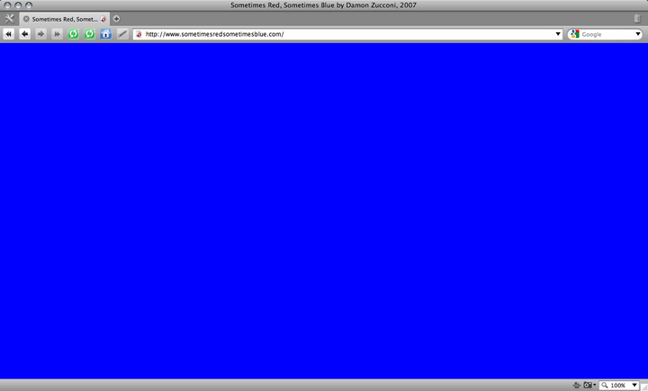
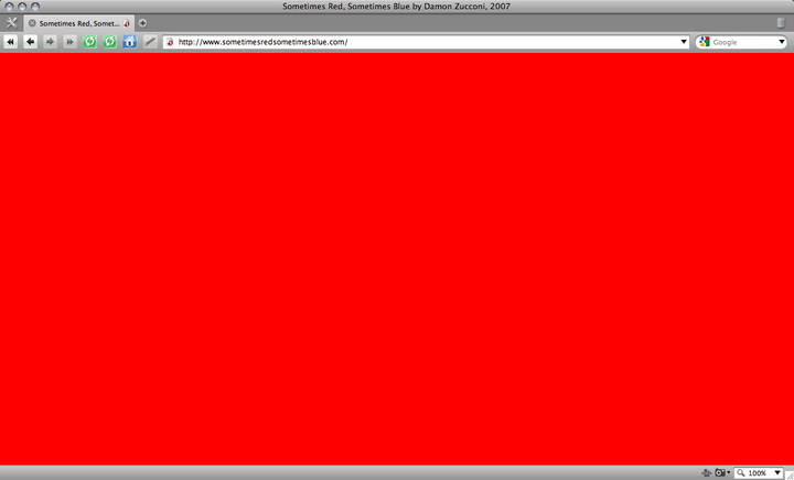
The fact that »single serving sites« come from circles associated with net culture is proven by humorous examples such as Damon Zucconi’s »Sometimes Red Sometimes Blue .com«3 (2007) or »Because Why .org«4 (2006) by Andy Simionato. The first site plays around with programmed randomness and shows a completely monochrome field that – as the title suggests – is sometimes red and sometimes blue, nothing more. The second example consists of two sub-pages that both contain links to one another and follow the linguistic logic of a dialogue consisting of the words »because« and »why« taken to an extreme.
»You Talking To Me .com«5 (2009) by the veteran Belgian-Dutch net.art master Jodi is much more elaborate. In an endless loop, altogether five »single serving sites« programmed as single destinations keep leading to each other; the auto-forwarding from one site to the next shows them to be a pop-cultural reference to Robert De Niro’s famous monologue in the film »Taxi Driver«: »Well I Am The Only One Here .com« (2009), »Who The Fuck Do You Think You Are Talking To .com« (2009) etc. – access is possible at any time and place.
Jan Robert Leegte’s »Blue Monochrome .com«6 (2008) is more critical of the unthinking consumption of websites, but no less playful. The Dutch artist employs the tools provided by Google Earth to use satellite images of the earth’s watery surface as readymades. Geographic coordinates are connected with those of the website, real space is associated with the virtual one, while the title of the artwork represents in words what can be seen in the image: a blue monochrome field that directly recalls Yves Klein’s thick acrylic paint on the canvas. An art-historical view of the world, compared with Google’s view of the world – in one line, but several layers.
Translated by Timothy Jones
1 http://www.theurlistheartwork.com
2 http://www.isthisyourpaperonsingleservingsites.com
3 http://www.sometimesredsometimesblue.com
4 http://www.becausewhy.org
5 http://www.you-talking-to-me.com
6 http://www.bluemonochrome.com