
Issue 4/2010 - Politisches Design
Retro rules
Over and above »orange« innovation, political design in Ukraine focuses on traditional visualisations of purportedly great moments of the past
Political design from Ukraine has only made the international headlines once recently, and in the process ensured that the country would be associated worldwide with one particular colour for years to come. Although the success of the colour orange was naturally not simply thanks to Dmytro Maksymenko, the little-known designer who created Viktor Juščenko’s successful presidential campaign in 2004. The country was of course polarised along specific political and cultural lines, a phenomenon which so-called »political technologists« deftly used for their own ends. The group that had previously held power was replaced by another, and the newcomers dubbed the whole protest, with oodles of pathos, the »Orange Revolution«.
However before this historic apogee in 2004/05, there was of course also a need for political design in post-Soviet Ukraine, and in the first instance this primarily engaged with classical forms of »nation building«. In this context however no-one was in too much of a hurry to give visual expression to state independence and above all to emphasising the demarcations between the country and the Soviet Union. Visual redesign was apparently not a priority for the country’s rulers, initially recruited primarily from the ranks of Communist functionaries. In public space and in the media, countless realms kept their Soviet look for years and years. This can to an extent be explained by the biographies of the new rulers: as was also the case in other Soviet republics, independence from the USSR was implemented in formal terms by the local CP in Ukraine. Leonid Kravčuk, who was elected as the first Ukrainian President in December 1991 and remained in this post until 1994, could boast a glittering career as a top Communist apparatchik.
Early 1992 - Ukraine had already declared its independence in August 1991 – saw the first official change to the way the state looked. First of all the parliament adopted a new blue and yellow state flag in late January, and a few weeks later a new state coat-of-arms was also introduced, a so-called »tryzub« (»trident«) in gold on a blue background. In the 1994 constitution the gold was ultimately replaced by yellow. The graphic mission was clear and has been paradigmatic for official representations of the state ever since: rather than adopting innovative new graphic designs, the young state was first and foremost to be presented as the direct successor of past Ukraines. In terms of the symbols of state, the principal point of reference was the Ukrainian People’s Republic (UNR), a state that existed between 1917 und 1920 on more or less shaky foundations with the same flag as the newly independent Ukraine and with an embellished trident as its coat-of-arms. In making this aesthetic choice, the parliament concurred with the wishes of Ukrainian nationalists: the »People’s Movement of Ukraine« (Narodnyi Rukh Ukrajiny) , an opposition party up until 2005, had already used the UNR colours in the late 1980s and deployed the previously forbidden »tryzub« in the party’s logo.
References to the attempts made over the last 70 years to establish an independent Ukraine have at times assumed rather peculiar forms: in August 1992, a Canadian by the name of Mykola Plavjuk, who considered himself to be President-in-exile of the Ukrainian People’s Republic, announced in a solemn ceremony in the parliament in Kiev that he was now transferring his powers to the elected President Kravčuk.
Although similar trends can also be detected in other Eastern European countries, this enormous aesthetic backwardness among political elites is more pronounced in Ukraine. This is reflected clearly in the semi-official visualisation of political messages. This has not changed at all since the »Orange Revolution«. On the contrary, as numerous monuments from the Juščenko era demonstrate, this trend has if anything become more pronounced.
Two examples from western Ukraine. At the station in the border city of Užhorod, the local authorities opened a small museum area about two years ago, focussing on Heorhij Kirpa (1946–2004). The then Minister of Transport, who is still held in great esteem posthumously in western Ukraine thanks to the major rail projects he promoted, took his own life just a few days prior to the »Orange« regime change. At the time observers took the view that this could well be related to a possible criminal prosecution. In the station a white larger-than-life Kirpa bust was placed on a marble pillar bearing his name in gold letters. Next to this stands a dark case displaying personal documents of the deceased. There is absolutely no trace here of contemporary exhibition design trends; it is a Soviet presentation in the style that had held sway for decades.
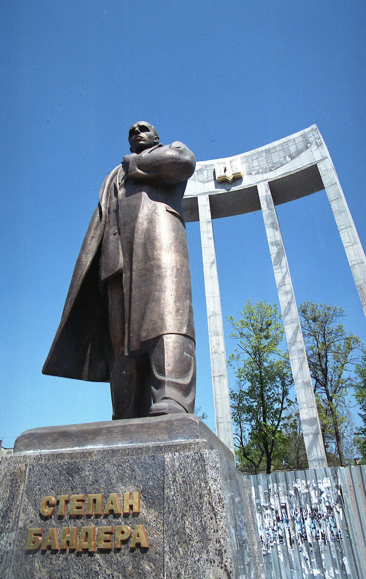
In L‘viv, formerly Lemberg, the authorities have over the past few years erected a giant monument to Stepan Bandera. The Ukrainian nationalist leader was murdered by the Soviet secret service in 1959 in Munich – he is a controversial figure in the more Russian-speaking eastern part of the country, whereas in the Ukrainian-speaking west of the country he is definitely viewed as a positive figure in national history. The seven-metre-high sculpture depicts Bandera in classical Soviet sculptural style; he is clasping his left fist to his chest in a gesture dripping with pathos. What’s more, in the background a slightly modernist-looking triumphal arch with a golden »tryzub« reaches up almost 30 metres into the heavens. A further symbolically significant detail is the fact that the arch rests on four columns. These represent the days of Kievan Rus (a predecessor of Belorussia, Russia and Ukraine), the era of the Cossacks (in the 17th century Ukrainian Cossacks formed a kind of state), the UNR period and contemporary independent Ukraine. The latter state has vigorously emphasised its continuity with these three historic Ukraines over the last few years. In addition, in order to foster cohesion between the politically and culturally polarised population, President Juščenko has also emphatically highlighted the tragedies that marked the country in the 20th century. In this context Juščenko focused in particular on the Holodomor; the way in which this catastrophic Stalin-era famine, which was caused intentionally, was interpreted assumed the status of a central domestic policy issue. Juščenko also had monuments to the Holodomor set up.
Even the »Orange Revolution« itself became the subject of commemorations in record time, the first shooting up as early as 2007 on Kontraktova plošča in the Kiev district of Podil, recalling the fact that Ukrainian students set up the first tent city of the »Orange Revolution« on this spot in November 2004. Even the President arranged to be feted in front of a giant marble block on downtown Sofijska plošča. The inscription: »On this spot on 22nd January 2005 the People’s President Viktor Juščenko was elected, sworn in and inducted as hetman (military commander) of Ukraine with the free votes of the Grand Council of Ukrainian Cossackhood«. With a Messianic sense of the message he was conveying, the President of the day attempted to establish a durable underpinning for Ukrainian national thinking. He seems to have failed in this endeavour on the political front, for his national political design only appealed to a minority of the electorate. Despite the PR possibilities his office offered, he notched up only 5.5 per cent of the vote in the first round of the presidential elections in 2010. His successor, Viktor Janukovyč, rapidly overturned numerous decisions on history policy adopted by his predecessor. We can expect to see a sharp decline in the number of new monuments referencing former important, tragic epochs in the life of the nation.
[b]Products and political campaigns.[/b]
A few years ago Juščenko’s visual communication looked significantly fresher, and in 2004 intelligent political design was also one of the decisive factors in securing the »Orange Revolution«. Kiev designer and photographer Dmytro Maksymenko was behind that: with his firm Belka & Strelka he concentrated primarily on launching new products and successfully introduced various juices, mineral waters and sausages onto the Ukrainian market. The graphic complexity of products and political campaigns is comparable, in Maksymenko’s opinion: »People would like to make things ever more attractive; however this will not function – only primitive aesthetics have an impact. What is much more important are the words on posters. Although Ukrainian written culture has been completely lost too«. However, this could be an important part of visual communication. In this respect, Maksymenko sees a connection with the way in which the visual arts developed in Soviet Ukraine, where this sphere was always considerably less important than in the USSR’s capital, Moscow. Even today the Kiev art scene is very much focused on Moscow, and this is only starting to change slowly as new institutions such as the Pinchuk Art Centre emerge.
Maksymenko also initially earned his spurs in political design under the influence of Moscow. In the late 1990s, prominent Moscow gallerist Marat Gel‘man, who had already been involved in political campaigns in Russia for several years, was commissioned to design the political campaign of the Social Democratic Party of Ukraine (united) (SDPU(O)) – and back then Maksymenko worked for him.
In 2004 he was subsequently commissioned to produce the graphic design for Juščenko’s electoral campaign. Strict instructions were of course given by the politician’s team. For example, a horseshoe was to be used – as a good luck symbol and simultaneously as a nationalist reference to a Cossack assassinated in the 16th century who went by the name of Ivan Pidkova (Ivan Horseshoe); the word »Tak« (Ukrainian for »yes«) and an exclamation mark were to appear as well. However, it was colour that proved to be the central aspect of this visual communication and here insider information played an important role. As early as spring 2004 Maksymenko’s client assumed that the electoral campaign would continue until well into the winter. »The whole of Kiev is grey and dirty then. That meant it had to be a strong, eye-catching colour«, explains the designer.
However, one of Maksymenko’s favourite books also influenced the decision to choose orange. In his »Eulenspiegel« epic, Belgian author Charles de Costers (1827–1879) describes the struggle for liberty against the Spaniards led by Willem van Oranje – an era when orange became a symbolic colour for the Dutch.
A particular economic consideration was also important for the campaign. Funds were limited, indeed Maksymenko was never paid, and the colour orange is to be found in every printer’s workshop. It was also relatively easy to produce orange plastic strips that supporters of the candidate’s campaign could attach to their clothing somewhere clearly visible. In addition, the design incorporated a subtle echo of Communist aesthetics, with a view to ensuring greater support in the industrialised east of the country, and deployed forms that could be reproduced fairly easily. Juščenko’s opponent Janukovyč opted for light blue, and both parties made massive use of »negative campaigning« too – Janukovyč’s team circulated pamphlets with caricatures depicting Juščenko as a Nazi. Aesthetically, these were fatally reminiscent of Marat Gel’man’s electoral smith.
Whilst an eye-catching campaign was still a decisive element in the 2004 elections, this was no longer the case by the time the 2010 presidential elections rolled round. Julija Timošenko’s text-heavy campaign with »She works« (»Vona – pracjuje«) did not help her scrape together a relative majority. She even lost votes amongst younger voters to the other liberal candidate, Arsenij Jacenjuk, who scored with military aesthetic and slogans like »New industrialisation« or »A productive village«. Janukovyč, who had lost in the 2004 elections, was victorious with unexciting slogans and portrait photographs in which he looked like a Soviet apparatchik.
What developments are we likely to see in Ukrainian political design in the near future? Under the new President there have been noticeable restrictions in the media and public sphere over the last few months, and the defeated candidate, Timošenko, has vanished almost entirely from television screens. Against this backdrop of media control, demonstrations by opposition parties, staged in TV-friendly formats, may well grow less important. Designer Maksymenko speculates that political communication may develop towards a »partisan aesthetic « – alluding here to West Ukrainian partisans, who offered isolated resistance to the Soviet regime well into the 1950s. In fact, it is striking that radical groups to the left and right are increasingly putting up stickers in public space and spraying graffiti with templates. L‘viv in Western Ukraine seems to play a pioneering role in this respect. Right-wing radicals there have recently discovered the walls of the historic centre, spraying slogans such as » Ukraine for Ukrainians« or motifs portraying members of the Waffen-SS division Halyčina as heroes.
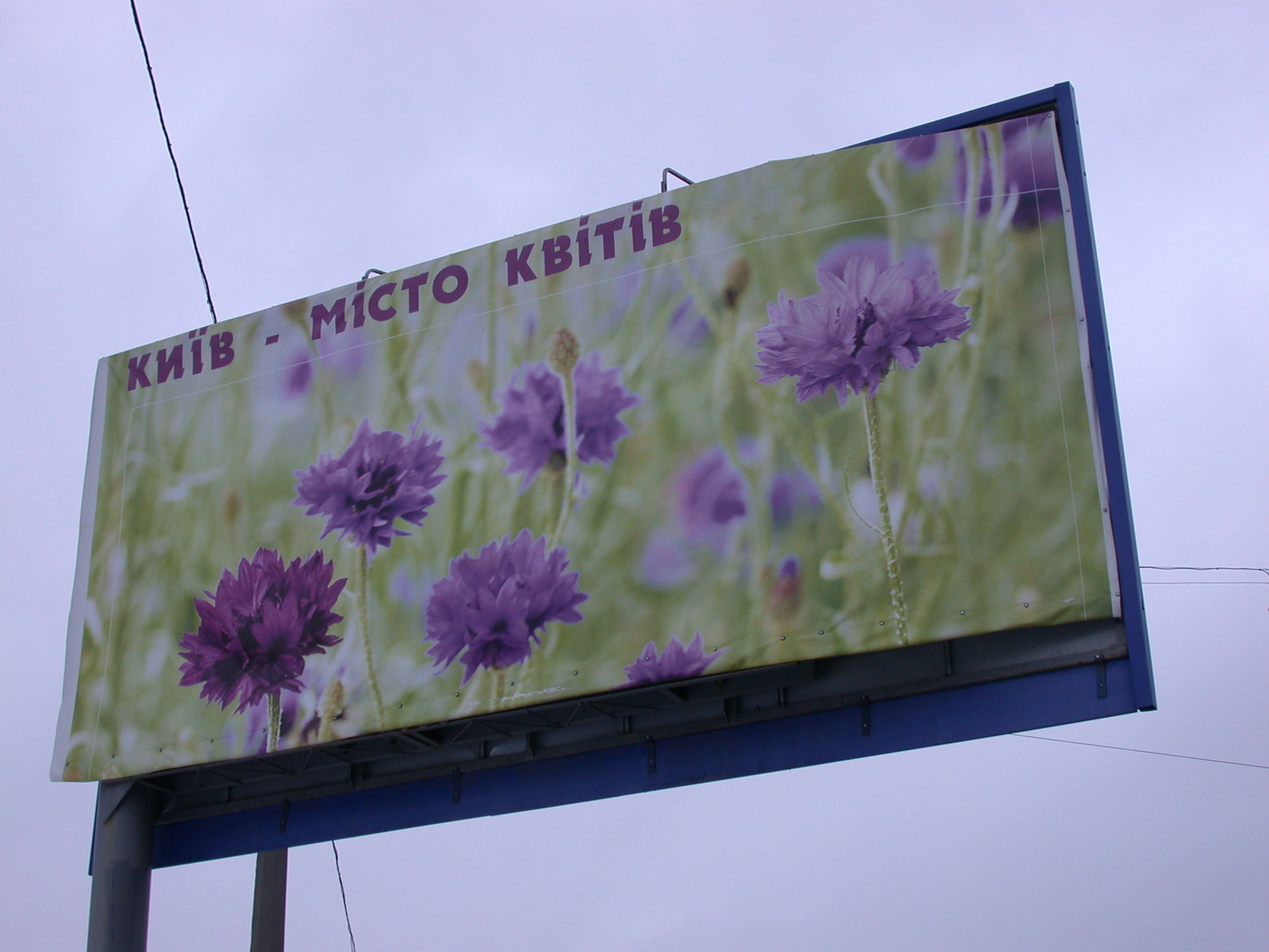
At the same time however Soviet traditions are also continued. This is particularly noticeable in the capital, Kiev, where »social advertising« – which elsewhere might be dubbed »public service advertising«– is everywhere. This is due in particular to a permanent economic crisis, which leaves advertising space free for the public sector. Repeated campaigns have addressed the demographic situation, for example in 2005, when punning text-based posters called for more sex, as there aren’t enough footballers, Oscar award-winners and Ukrainians. On the whole however a straightforward visual idiom is used to appeal to local or national patriotism. These kinds of campaigns pronounce Kiev to be the »city of flowers« or enthuse »Oh my Kiev«, whilst yellow-blue banners exhorting citizens and visitors to »Love Ukraine« have been a fixture of the cityscape for years. None of these forms of political advertising will go down in the annals of art or design history.
Translated by Helen Ferguson